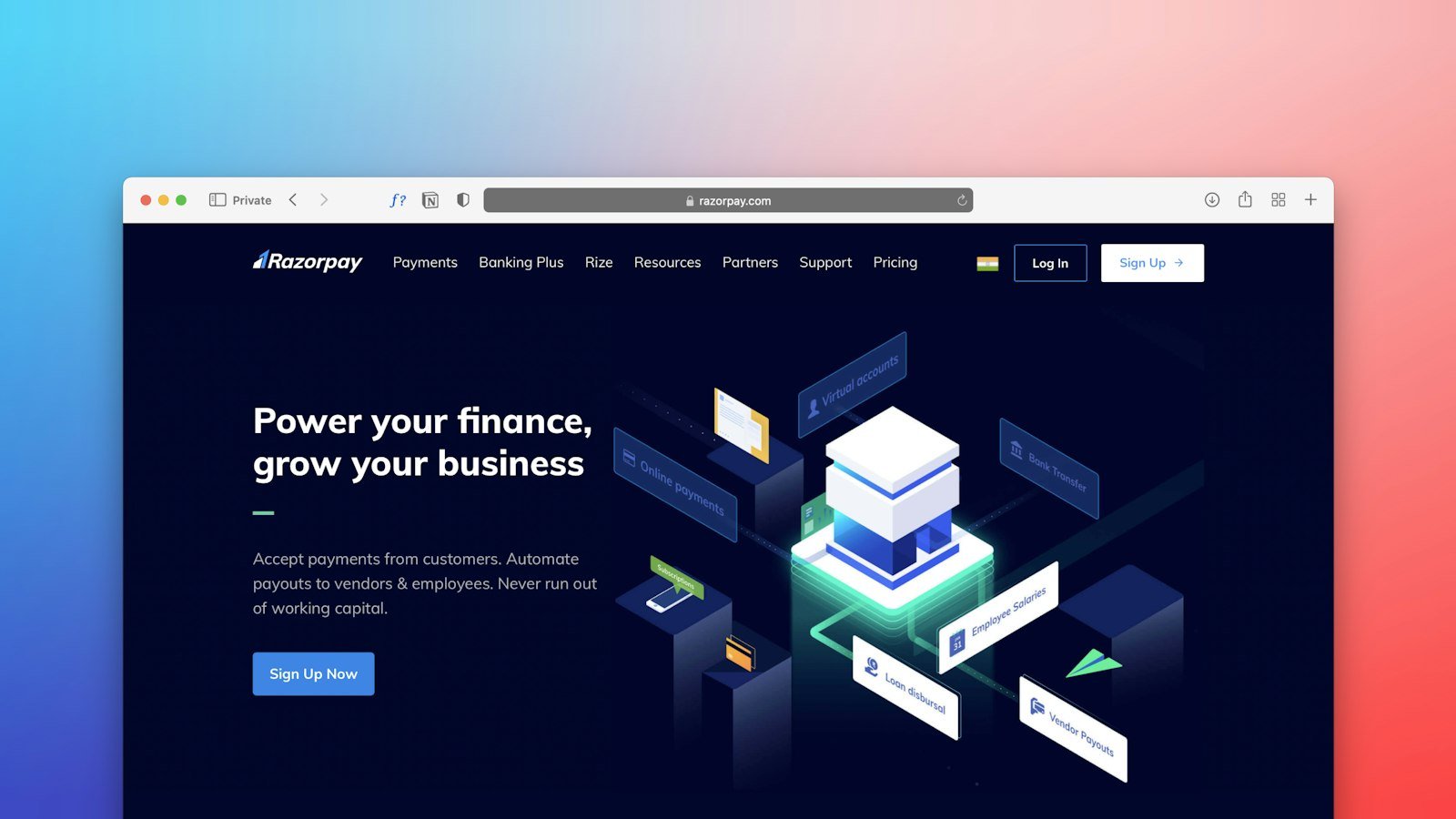
Having a beautiful website is not the same as having a website that brings in clients. Use this checklist to see whether your website is ready to turn visitors into leads.
1. A clear message at the top
In a few seconds, visitors need to understand what you do, for whom and where. Avoid generic phrases like “solutions of excellence”.
2. A WhatsApp button always visible
Most people prefer to message on WhatsApp rather than fill in a form. Keep the button fixed in the corner of the screen with a ready-made opening message.
3. Calls to action in every section
“Request a quote”, “Book an assessment”, “See pricing”. Every part of the website should end with a clear next step.
4. Trust signals
Client logos, projects, real testimonials and Google reviews show that other people have already trusted you.
5. How it works and how much it costs
Explaining the steps of the service and, when possible, showing prices or price ranges reduces doubts and filters leads that are more likely to close.
6. Fast loading
Every second of waiting increases the chance that visitors give up. Optimized images and lightweight code make a difference.
7. Perfect on phones
A large share of visits comes from phones. Readable text, big buttons and nothing cut off on the screen are a must.
8. Technical SEO
Correct titles, descriptions, structure and structured data help the website be found on Google and cited by AI tools.
9. A simple form
Ask only for the essentials: name, WhatsApp, email and a message. Long forms scare visitors away.
10. Lead tracking
Set up Google Analytics and conversions to know where leads come from. Without measuring, you cannot improve.
How to use this checklist
Open your website on your phone and go item by item. If three or more are missing, it is worth reworking the structure before investing in ads.
Putting the checklist into practice
Run a simple test with three people who do not know your company. Ask each of them to open the website on their phone and answer, in under a minute:
- What does this company do?
- Where does it operate?
- How much does it cost, or how do I request a quote?
- How do I get in touch right now?
If anyone gets stuck on one of these questions, you have found the point to improve. This test reveals problems the business owner does not notice, because they already know everything by heart.
Example of a header that converts
Compare two headers for a solar energy company:
- Before: “Sustainable solutions for a better future.” Button: “Learn more”.
- After: “Solar energy for homes and businesses in [city]. Cut your electricity bill with complete design and installation.” Button: “Simulate your savings on WhatsApp”.
The second one says what it is, for whom, where, the benefit and the next step. That clarity is what turns visits into leads.
The ideal order of sections
- Header with a clear message and an action button.
- Client logos or real numbers right below, to build trust.
- Services explained simply.
- How it works, in a few steps.
- Projects, before and after, or case studies.
- Testimonials and reviews.
- Prices, plans or how quotes work.
- Frequently asked questions.
- Final call with WhatsApp and form.
Small details that increase leads
- Pre-filled WhatsApp message: “Hi! I came from the website and would like a quote for…”. It makes the first step easier.
- Visible opening hours: avoids frustration for people who message outside business hours.
- Response time: “we reply within X hours” builds confidence.
- Real photos of the team and the space: they build more trust than stock images.
- Clickable phone number on mobile.
- Address with a map, for businesses with in-person service.
Mistakes that drive leads away
- Pop-ups covering the phone screen right on arrival.
- Forms that ask for too much information.
- Buttons with vague text, like “Click here”.
- Outdated information, such as old hours or phone numbers.
- A slow website, especially the images at the top.
Conclusion
A website that generates leads does not depend on special effects, but on clarity, trust and ease. Review your website with the checklist, run the test with outsiders and fix one point at a time. Each improvement brings the visitor closer to the WhatsApp conversation.
Frequently asked questions
Form or WhatsApp: which is better?
Both. WhatsApp is faster for the visitor; the form works outside business hours and organizes the information. Ideally, offer both options.
My website is beautiful but doesn’t bring leads. Why?
Usually the message is unclear, there are no calls to action or trust signals, or the website is slow on phones. The checklist helps you find the problem.